The Docubee engineering team spent 2021 collecting feedback from customers and listening to suggestions about how we could enhance our solution. Our newly launched UI takes all of this into consideration to ensure you have all the tools needed to automate whatever slows you down at your business.
Let’s take a look at some of the highlights.
Groups are Now Workspaces in Docubee
A quick note before we dive in, groups in Docubee will now be called workspaces. This update has been made to keep up with industry standards in automation. Don’t worry, your workspaces still work the same as before.
How Do I Opt-in to the New UI?
If you don’t have the option to switch to the new beta version in Docubee but would like to give it a try, email customersuccess@docubee.com. You can opt back out using the arrow in the bottom left of the new menu bar.
Better Navigation in the Dashboard Overview
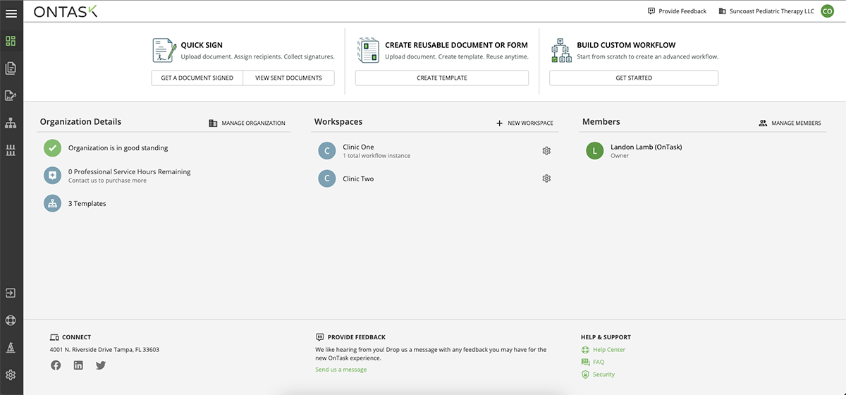
The top-level navigation of Docubee has been reorganized to make it easier to find essential functions, and the new dashboard gives full visibility into organization details, workspaces, and organization members as well.
This new layout allows you to quickly access documents you’ve sent for signature, or manage/edit your workflow templates and track their active/completed instances. Additionally, you can quickly send a document for signature, create reusable documents or forms, as well as build custom workflows from the menu at the top of the dashboard.
New:
Old: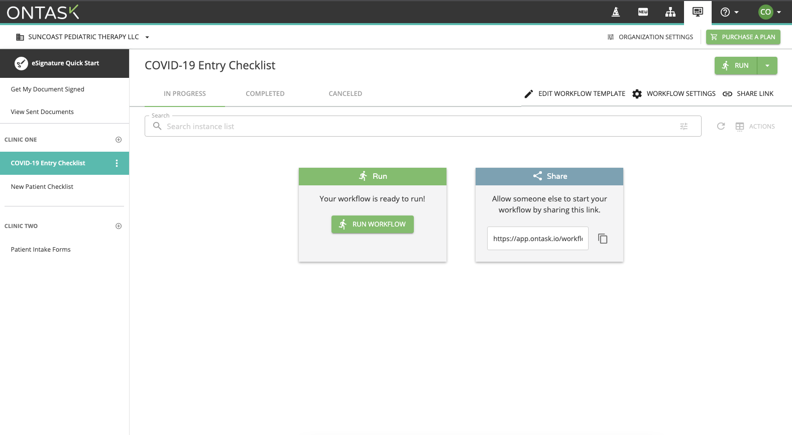
We’d also like to note that we’ll be collecting feedback during this beta launch, and this area may change in the future. Be sure to add your feedback if there is anything you’d like to see.
Templates
The new and improved templates view now shows you all workflow templates you have access to by default, and still allows you to filter by what workspace they belong to. Now, you have the option to search for a template by name in the top search bar, and even select all workflows to make bulk changes.
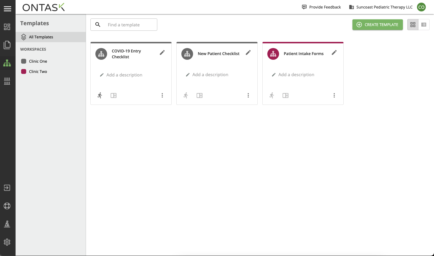
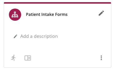
You’ll also notice that workflow templates are now represented by cards rather than in the leftmost list as shown in this example of the classic Docubee. These new cards allow you to quickly identify a template with user-created descriptions and titles. Using the buttons on the card, you can run your template, view active and completed instances, and find other options such as editing or archiving templates. Each template card in the new UI is also color-coded to help you quickly identify which workspace it belongs to.
New Document Section Added
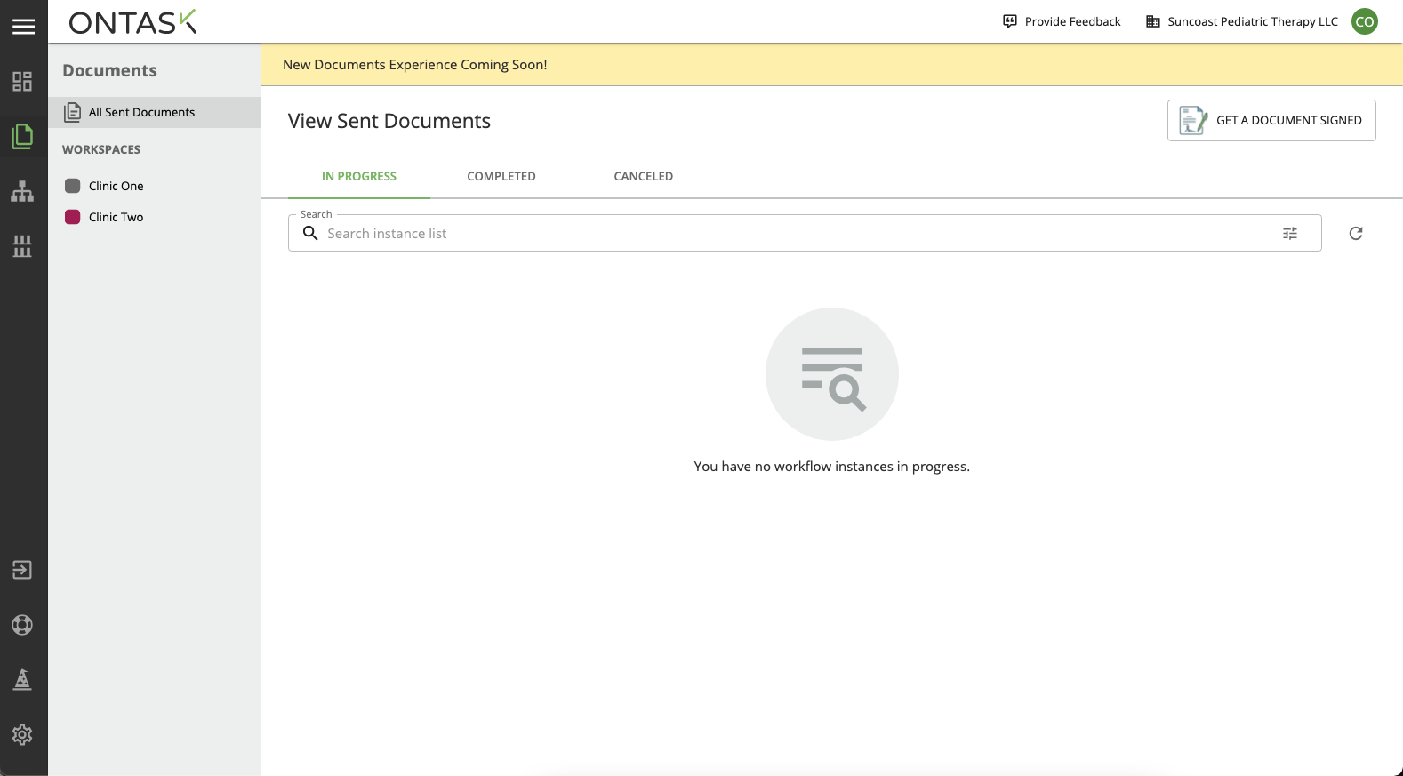
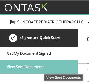
The new documents tab we’ve added makes it easier to see any in-progress, completed, or canceled documents. Be sure to keep an eye out because we’ll be further expanding the area with more features later this year. For now, this will work exactly the same as in the classic version of Docubee.
New:
Old:
Template Library
The template library now lives on the left side of the screen under the new documents section. This means you can access hundreds of customizable templates from within the platform—more extra clicks and searching for what you need. All features in the template library have stayed the same, but be sure to take a look at all the new templates that have been added.
How to Leave Us Feedback
We’d love to hear any comments or feedback you have in the new UI. At the bottom of your new dashboard in the provide feedback section, you can quickly send us a message with your thoughts and feedback.
If you have any questions about the new UI, be sure to contact us by emailing your customer success manager or sending us a message here. We want to ensure you’re getting the most from the new UI, and are here to support you along the way.


